Interior Design with Floor Plan How to Build Schemes Fast
Learn interior design with floor plan workflows for space planning, furniture placement and quick client-ready renders. Practical steps, costs and examples
The client review starts in twenty minutes. You have a polished material palette, a strong furniture concept, and a floor plan that looks straightforward. Then someone asks whether the sofa blocks the route to the kitchen, whether a wheelchair can turn in the bathroom, or why the dining table sits in the afternoon glare. At that point, finishes stop mattering. The floor plan has to prove that the scheme works.
That's the practical meaning of interior design with a floor plan. The plan controls circulation, sightlines, adjacency, privacy, furniture fit, and many of the decisions that later appear in elevations and renders. Once the geometry is verified, you can move quickly from zoning studies to client-ready isometric views and staged room visuals without building a full 3D scene for every early option.
Table of Contents
- Why Great Interiors Start With the Floor Plan
- How to Read a Floor Plan Before You Design
- Space Planning and Furniture Placement From the Plan
- Quick Turn Workflow From Floor Plan to Client Ready Visuals
- Costs Turnaround and When to Use Each Rendering Option
- Frequently Asked Questions About Interior Design With Floor Plan
Why Great Interiors Start With the Floor Plan
A good interior scheme doesn't begin with a sofa style or a paint color. It begins by answering where people enter, where they move, what they see, what they need to reach, and which rooms should connect or remain separate. The floor plan is the document that lets you test those decisions before they become expensive construction or procurement problems.
During a review, a plan may show a generous living room. Place the actual sofa, coffee table, media unit, circulation path, and door swings on top of it, and the apparent space can disappear quickly. The same thing happens in compact homes, where a small shift in a wall, opening, or storage zone affects several rooms at once. A second dataset containing 80,073 plans reports an average plan area of 102.0 m², with plans ranging from 63.2 to 201.4 m², and an average of 2.48 bedrooms per plan in the referenced floor-plan dataset. That's a useful reminder that many residential interiors are multi-room environments where every square meter has a job.
The plan is the control document
Treat the drawing as a coordination layer, not a decorative background. It should answer practical questions such as:
- Circulation: Can someone move between the entry, kitchen, living areas, bedrooms, and bathrooms without crossing furniture?
- Adjacency: Are rooms that support one another located close enough to work efficiently?
- Privacy: Can a guest see directly into a bedroom or bathroom from the main entrance?
- Sightlines: What appears from the front door, the dining table, the sofa, and the main circulation route?
- Furniture fit: Do the selected pieces fit with usable clearances, not just within the room boundary?
Historically, floor plans have served this role for a long time. Early known examples came from ancient Egypt, where drawings represented tombs and temples. Greek and Roman traditions developed the language further, medieval plans added doors, windows, and stairs, and Renaissance architects such as Leonardo da Vinci and Andrea Palladio used plans to support more accurate spatial representation. Later, CAD brought much greater drafting precision, while the open floor plan became a significant early-20th-century design concept, with Frank Lloyd Wright's Prairie School often cited as an influence in this history of floor plans.
Practitioner takeaway: Every square meter is a decision. If the plan hasn't proved the route, the sightline, and the furniture fit, the finish schedule is premature.
Why visual speed matters after planning
Fast visuals are useful only after the plan is reliable. An isometric view can expose a blocked doorway or awkward furniture relationship more clearly than a flat drawing, while a staged room view helps clients understand atmosphere and material direction. The efficient sequence is therefore plan first, visual second, not decoration first and geometry later.
For broader context on how drawings communicate design intent, see this guide to architectural drawing types. The same principle applies throughout the workflow: use the floor plan to make decisions, then use visuals to make those decisions easy to review.
How to Read a Floor Plan Before You Design
A floor plan is usually read as a scaled overhead drawing, imagined as if the building were sliced horizontally at about one meter above the floor and viewed from above as described in this floor-plan reading guide. That explains why wall lines, structural elements, door openings, and orientation carry more design information than surface decoration.
Before placing furniture or discussing finishes, verify the drawing. A clean base file prevents a surprisingly large amount of rework.
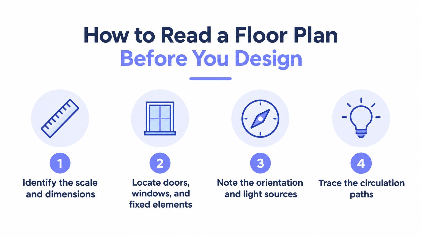
Run the pre-design check
-
Start with the title block. Confirm the project name, drawing number, issue information, and the latest revision. Don't design from a superseded plan just because it's the file someone emailed first.
-
Verify the scale bar. Use the graphic scale bar rather than relying only on the written ratio. A PDF can be printed, resized, or exported incorrectly, while the scale bar gives you a direct visual check. Measure a known dimension and compare it with the drawing before pricing furniture or calculating quantities.
-
Read the shell. Identify wall thicknesses, structural walls, columns, shafts, stairs, windows, and fixed plumbing points. A thin partition and a structural wall may look similar at a glance but offer very different opportunities.
-
Read the openings. Door swings show how rooms operate. Window positions reveal daylight, views, ventilation opportunities, and furniture restrictions. A door that technically fits can still create a clash with a wardrobe, vanity, or dining chair.
-
Confirm room dimensions. Check whether dimensions refer to finished faces, structural faces, or another reference. Note irregular corners and areas where built-in storage will reduce the usable footprint.
-
Trace movement. Draw the route from the primary entrance to the main rooms, then trace service routes such as garage to mudroom to kitchen. Look for dead ends, narrow pinch points, furniture conflicts, and paths that force people through a seating area.
Use symbols as evidence, not decoration
Plan symbols provide clues about how the building operates. Doors, windows, stairs, fixtures, cabinetry, and section markers each affect the scheme, even when they don't look visually prominent. A practical reference on floor plan symbols can help standardize that reading across a team or client presentation.
Accuracy comes before aesthetics. If the scale, openings, wall thickness, and revision status aren't verified, any furniture plan or visual output is only an attractive assumption.
Finish this stage with a marked-up base drawing. Keep one clean original, one annotated working copy, and a short list of unresolved items. That separation matters when a client later asks whether a wall moved or whether a visual reflects an existing condition.
Space Planning and Furniture Placement From the Plan
Space planning is where the floor plan becomes a design instrument. Start with broad zones, then test movement and furniture. Don't begin by selecting individual objects because a beautiful chair can distort the entire room if its location, depth, or relationship to the circulation path hasn't been resolved.
A useful first pass is to mark arrival, social, service, private, and quiet or flexible zones. In a compact home, one room may carry several roles, but the plan should still show how those roles are separated. A desk behind a sofa, a wellness nook beside a bedroom, or a storage wall near the entry can create definition without adding a full partition.
Block the plan before styling it
Use simple rectangles and clearance zones first. Test the largest furniture items before adding decorative pieces:
- Living areas: Place the sofa, primary chairs, coffee table, media unit, and the route through the room. Check whether people have to cross the conversation area to reach another destination.
- Dining areas: Place the table with chairs pulled out, then test the route to the kitchen and any nearby doors. A table that fits on paper may fail once chairs are occupied.
- Bedrooms: Position the bed, bedside tables, wardrobes, and dressing route. Check door swings and whether storage doors compete with the bed or circulation.
- Kitchens: Map the working relationship between preparation, cooking, cleaning, refrigeration, storage, and the main passage. Don't let an island become an obstacle just because it fills an empty center.
- Bathrooms: Place fixtures, show door swings, and reserve the required clearances. Room area alone doesn't prove usability.
For practical furniture decisions, this guide to furniture placement in a living room is useful because it keeps the discussion tied to routes and relationships rather than isolated pieces.
Choose the right degree of openness
Fully open plans can improve visual connection, but they can also transfer sound, expose mess, and make furniture layouts harder to control. Semi-open and broken-plan solutions often work better when a household needs both connection and separation. Partial walls, arches, changes in level, pocket doors, shelving, curtains, and furniture zoning can define rooms without closing them completely.
Ask the client direct questions:
- Does the television need acoustic separation from the kitchen?
- Should guests see the kitchen immediately from the entrance?
- Does someone work from home during family or entertaining hours?
- Is there a place for exercise, meditation, reading, or recovery?
- Where do coats, shoes, bags, sports equipment, cleaning supplies, and deliveries land?
- Which rooms need to adapt as children grow or household routines change?
Current design coverage highlights in-home wellness areas, warm material palettes, lifestyle-focused flooring, purpose-driven rooms, and more nuanced zoning in these interior trend predictions. The practical implication isn't to copy a trend. It's to reserve enough usable space for the way the client lives.

Prove accessibility, not just openness
A room can look open and still be difficult to use. Accessibility-focused planning should show clear door widths, 60-inch turning circles, continuous routes, and kitchen and bathroom clearances, especially when the project involves an accessible unit or wheelchair-accessible layout as emphasized in this ADA house-plan guidance. Those checks belong on the plan before furniture styling begins.
Don't hide a turning circle beneath a decorative rug or rely on a wide-looking room. Draw the route, place the fixtures, and test the furniture in the same view. If the accessible path disappears once a chair, island, or side table is added, the plan needs revision.
A room is not functional because the furniture fits inside its walls. It's functional when people can use it, reach it, and move through it without negotiating avoidable obstacles.
The strongest space plans also anticipate change. A home office may become a guest room, a wellness corner may become storage, and a dining area may need to support working or study. Build flexibility into the zoning, but don't make every room vague. A clear primary function gives the interior a usable center, while secondary functions can be supported through movable furniture, concealed storage, and defined power or lighting locations.
Quick Turn Workflow From Floor Plan to Client Ready Visuals
Once the plan is verified and the furniture blocks are credible, produce visuals in a controlled loop. The purpose isn't to replace construction documentation or editable BIM. It's to give the client a clear, fast way to review spatial decisions before the team spends time on detailed modeling, specification, and final imagery.
Prepare a clean source
Export the plan as a clean JPG, PNG, or PDF, or scan a marked-up hand drawing at a readable resolution. Remove unrelated annotations, crop out excess page area, and make sure walls, openings, room labels, stairs, and fixed fixtures remain legible. If the plan has several levels, separate them clearly rather than forcing every floor into one crowded image.
Before uploading, annotate only what the visual process needs:
- Orientation: Mark the north arrow and important daylight directions.
- Openings: Identify doors, windows, large openings, and glazing that must remain visible.
- Fixed elements: Note columns, fireplaces, stairs, plumbing fixtures, cabinetry, and built-ins.
- Design intent: Mark the primary furniture zones, focal points, and any items that must not move.
- Review focus: Label the questions the client needs to answer, such as open versus semi-open zoning or sofa orientation.
Generate the right view for the decision
An isometric map is useful when the client needs to understand the relationship between rooms, walls, openings, and furniture. A room render is better when the discussion concerns materials, lighting, styling, or the atmosphere of a specific space. A mood board can support palette alignment, but it shouldn't stand in for a plan when the decision concerns fit.
Vizcraft offers ISO Mapper for floor-plan isometric views, Interior Design for boards from floor plans, and Exterior Studio for exterior concepts from photos. These images support design discussion; verify dimensions, openings, scale, and construction intent against the source drawings.
Use fast variation for live review
Cloud processing avoids local installation and a local render farm. Generation and review time depend on the input and workflow; prepare a few deliberate options before the client presentation rather than promising a fixed turnaround.
The useful word is deliberate. Create variations that answer a design question, not random style changes. For example, compare a sofa facing the garden with a sofa facing the media wall, or compare a fully open kitchen boundary with a partial divider. Keep the camera, crop, and core geometry consistent so the client sees the layout difference rather than a new visual language each time.
Perform quality control against the source
Never approve a visual because it looks attractive. Compare it with the verified plan:
- Walls: Confirm the perimeter, partitions, and structural elements are in the right locations.
- Openings: Check every door, window, stair, and major passage.
- Proportions: Compare room relationships and furniture scale with the source dimensions.
- Fixed fixtures: Verify kitchens, bathrooms, fireplaces, columns, and built-ins.
- Circulation: Recheck the routes you tested in plan view.
- Accessibility: Confirm that required turning circles and clear routes remain visible and usable.
- Presentation: Remove options that introduce geometry errors, misleading materials, or clutter.
Traditional rendering workflows still have a place when the team needs fully editable scenes, exact detailing, controlled camera work, or final marketing imagery. A typical workflow moves from brief and requirements through 3D modeling, materials and textures, lighting, camera placement, rendering, and post-production as outlined in this architectural rendering process guide. For interior visualization, a camera height of about 1.5 m to 1.6 m, two-point perspective, and passes such as reflection, ambient occlusion, diffuse, and lighting are common production considerations in this rendering workflow reference.
The fast workflow fits at the option and approval stage. It gives the client something concrete to react to before the team commits to a longer production cycle.
Costs Turnaround and When to Use Each Rendering Option
The right visualization method depends on what the client needs to decide. A traditional studio render may be appropriate for a final hero image, a complex custom interior, or a presentation where every material and reflection must be controlled. A freelancer may be the better fit for a limited view set and a known brief. AI-assisted exploratory rendering is most useful earlier, when the team needs to compare layout, style, furniture, lighting, and zoning options without paying final-production effort for every possibility.
The comparison below uses qualitative cost and speed categories because studio and freelancer fees vary by region, scope, modeling condition, revision policy, and final image requirements.
| Deliverable | Studio Typically | Freelancer Typically | AI-Assisted Exploratory Render Typically |
|---|---|---|---|
| Verified plan-based option study | Higher setup cost, longer scheduling | Moderate setup cost, depends on availability | Lower per-image cost, fast iteration |
| Client-ready isometric layout view | Moderate to high, especially with custom modeling | Moderate, based on source quality and detail | Fast output for review and optioneering |
| Styled room concept | Higher when modeled from scratch | Moderate to high for bespoke scenes | Fast comparisons across controlled variations |
| Final photorealistic marketing image | Highest, with detailed modeling, materials, lighting, and post-production | Variable, often lower than a large studio | Better treated as exploratory unless the output passes project QC |
Do the per-view math before choosing
Vizcraft lists the Starter plan at $19 per month for 25 renders, the Pro plan at $49 per month for 100 renders, and the Studio plan at $99 per month for 250 renders. One-time packs start at $7, and the stated per-render range is $0.40 to $0.76 on the current Vizcraft pricing page. Those figures make the tool suitable for option studies where the team may need several views or variations before selecting a direction.
| Plan | Monthly price | Included renders | Approximate listed cost per render |
|---|---|---|---|
| Starter | $19/mo | 25 | $0.76 |
| Pro | $49/mo | 100 | $0.49 |
| Studio | $99/mo | 250 | $0.40 |
The practical calculation is simple. Estimate the number of plan views, room views, and controlled variations needed for the review, then compare that total with the available render allowance. Keep a buffer for failed uploads, geometry checks, and one or two alternatives. Don't create dozens of nearly identical images. A small, intentional set gives the client a decision to make and keeps the review focused.
For broader context on how scope changes rendering fees, use this guide to interior rendering cost. The decision isn't AI versus traditional production. It's speed plus polish. Use fast exploratory visuals to align the plan, furniture, and direction, then move the approved option into the traditional toolchain when the project needs precise final control.
Frequently Asked Questions
What file types work for a plan-to-visual workflow?
Use a clean JPG, PNG, PDF, or readable scan. Vizcraft also supports HEIC and WebP uploads. The file should show walls, openings, room labels, stairs, and fixed fixtures clearly, with unnecessary page space and unrelated notes removed.
How do I keep wall geometry accurate in a styled view?
Start with the latest verified plan, confirm the scale bar, and mark openings and fixed elements before generating a view. Compare every output against the source drawing, especially wall locations, door swings, windows, stairs, kitchens, bathrooms, and built-ins. Treat a generated image as a visualization for review, not as a replacement for dimensioned documentation.
How many variations should I show during a client review?
Show enough options to answer the actual design question, not every possible combination. For a layout discussion, use a controlled comparison such as furniture orientation, open versus semi-open zoning, or two material directions while keeping the camera and geometry consistent. Too many unrelated variations make approval slower because the client evaluates styling differences instead of the underlying plan.
How should I check accessibility before staging the interior?
Draw the required route directly on the plan, show door widths and bathroom or kitchen clearances, and include the 60-inch turning circle where applicable in this accessibility planning guidance. Then place furniture and check that the route remains continuous. If a render hides the clearance or makes the room look more open than it is, return to the plan and correct the layout before presenting it.
For account, workflow, and product questions, consult the Vizcraft FAQ. The practical sequence remains the same: verify the plan, test the furniture, select the visual that answers the client's question, and keep the source drawing in control.
Use Vizcraft to turn a verified floor plan into fast isometric views and room concepts for layout, zoning, furniture, and client review. Visit Vizcraft and try it with 2 free credits, no card required.