Interior Design Spatial Planning Explained with Examples
Learn interior design spatial planning principles, dimensions, zoning and workflows to create functional, beautiful rooms with fewer revisions.
A client walkthrough can expose a layout problem in seconds. The room looks polished in the render, but the entry door collides with a chair, the route to the kitchen cuts through the seating area, and there's nowhere practical to store coats, bags, or equipment. The finishes aren't the problem. The plan is.
Interior design spatial planning is the system that prevents those failures before they become expensive. It organizes movement, activities, furniture, storage, privacy, light, and access before you spend time choosing materials. A useful plan should answer simple questions: Where does someone walk? What needs to be close together? Which route must stay clear? Can the room support more than one routine?
The guide below treats a layout as a measurable working system. You'll find clearances you can check, examples for common rooms, a method for measuring an existing space, and a repeatable workflow for presenting options to a client. For a concise introduction to the subject, see this explanation of spatial planning.
Table of Contents
- Introduction to Interior Design Spatial Planning That Actually Works
- What Interior Design Spatial Planning Means in Practice
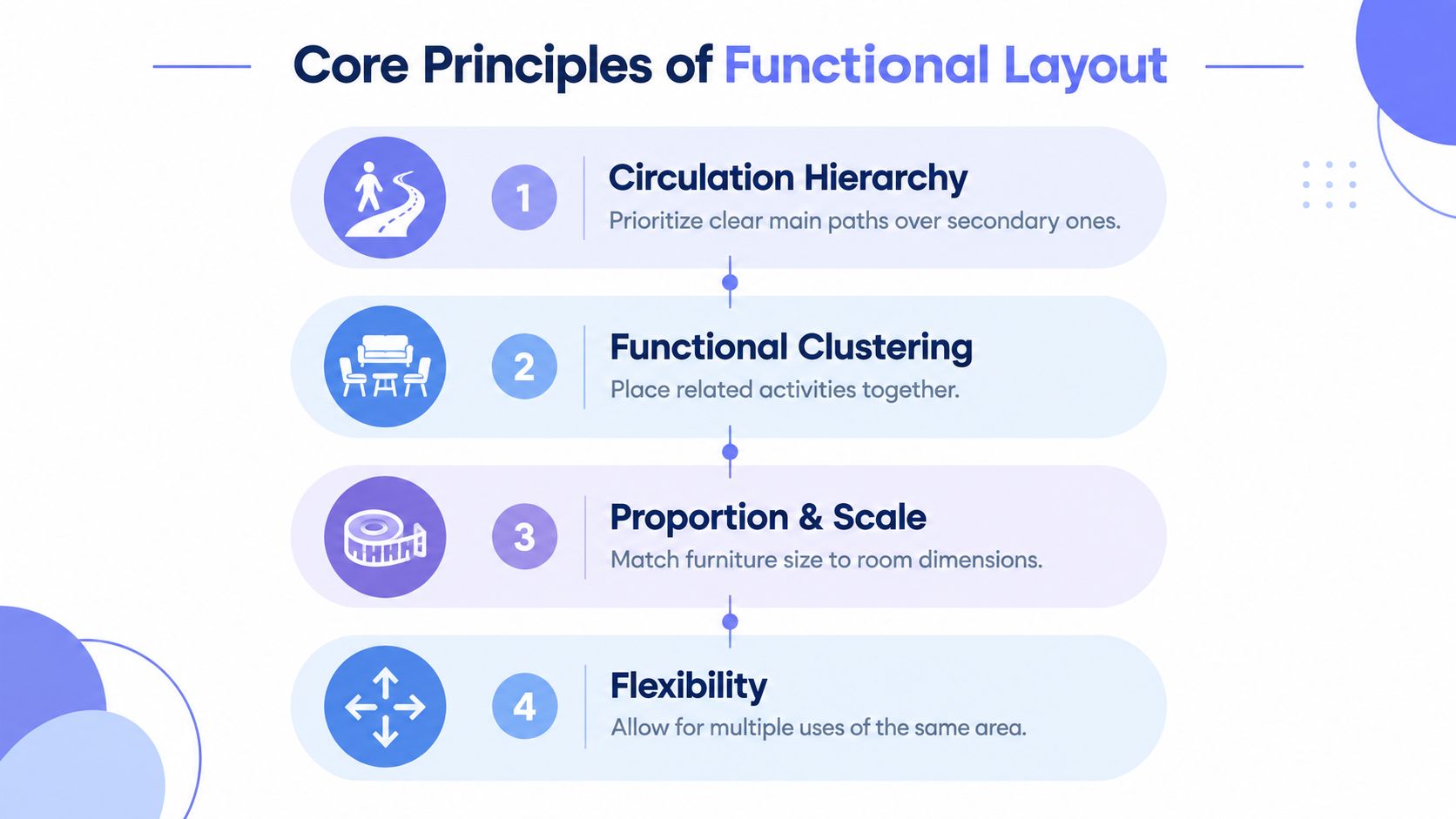
- Core Principles That Shape Every Functional Layout
- How to Measure and Dimension a Room for Spatial Planning
- Room by Room Spatial Planning Examples and Mistakes to Avoid
- Workflows Checklists Tools and Client Deliverables That Speed Approval
- Frequently Asked Questions About Interior Design Spatial Planning
Introduction to Interior Design Spatial Planning That Actually Works
Start with the route, not the sofa.
On a recent-style client walkthrough, the sitting room looked excellent from the main camera angle. A deep sectional faced the fireplace, two accent chairs completed the composition, and the coffee table created a convincing center. Then someone entered through the side door. The door leaf swung toward a chair, the fastest path to the kitchen crossed directly in front of the television, and the only storage wall was already occupied by artwork.
The room had been decorated. It hadn't been planned.
The layout has to support real behavior
A plan works when it matches the way people use the room, not just the way the room appears in a still image. A family room may need a direct kitchen route, a quiet television sightline, space for guests to pass behind seating, and storage that can absorb daily clutter. A bedroom may need a clear path around the bed, accessible wardrobe doors, and a practical relationship with the bathroom and laundry.
That's why I treat every interior layout as three connected drawings:
- The movement drawing, showing primary and secondary routes.
- The activity drawing, showing where people sit, work, cook, sleep, gather, or retreat.
- The support drawing, showing storage, lighting, power, doors, windows, and fixed services.
If one drawing conflicts with another, the plan needs work before finishes are selected.
Practical rule: If a piece of furniture makes a daily route awkward, it's too large, too close, or in the wrong location, even if it looks perfect in elevation.
A numbers-first way to judge a plan
You don't need to turn every project into a code review. You do need a small set of checkable tests. Start with a clear route, test door swings, allow turning space where mobility requires it, and measure the gap between furniture groups instead of relying on visual balance.
The following sections build that method from definition to application. You'll see how universal access changed the discipline, why broken-plan zoning is useful in compact rooms, how to dimension a plan, and how rapid visual iteration can expose circulation problems before the client commits to finishes.
What Interior Design Spatial Planning Means in Practice
Planning a city starts with movement. Streets connect neighborhoods, public spaces sit where people gather, and essential services need sensible relationships with homes and workplaces. A room works in much the same way. Its paths are streets, its furniture groups are districts, and its storage, lighting, and services are the infrastructure that keeps daily life moving.
Interior design spatial planning translates activities and constraints into zones, adjacencies, and circulation paths. In plain language, it decides what belongs where, what needs to be nearby, and how people get from one task to the next without crossing unnecessary obstacles.
From activity to layout
Begin with use, not furniture. Ask who uses the room, what they do there, when those activities overlap, and which actions need privacy or quiet. Then map the answers into relationships:
- Zones define activities, such as cooking, dining, working, sleeping, or relaxing.
- Adjacencies determine which zones should touch or remain close.
- Circulation identifies the routes people must take between entrances, rooms, storage, and services.
- Clearances protect those routes and make furniture usable.
- Sightlines control what people see from the entry, seating, work areas, and circulation paths.
A kitchen and dining area often benefit from proximity because food, dishes, and conversation move between them. A work nook may need visual connection to a living room but acoustic separation from the television. A powder room may be convenient near an entrance while remaining visually discreet from dining and seating areas.
This is different from decorating. Decorating selects finishes, colors, accessories, and furniture character. Spatial planning decides whether those elements can coexist without creating collisions or wasted space. You can change a rug without changing the room's function. You can't solve a blocked route with a new cushion.
Efficiency became inclusion
Modernist space planning developed in the early 20th century as designers applied scientific principles to organize space more efficiently during urbanization and under pressure from limited floor area. By the 1980s, architect Ron Mace coined the term universal design, shifting attention from an “average user” toward spaces usable by the widest possible range of people without specialized adaptation. This evolution is outlined in historical background on space planning.
Universal design frameworks emphasize seven principles, including equitable use, flexibility, simple and intuitive use, low physical effort, and appropriate size and space for approach and use. The practical result is straightforward. A good plan considers people with limited mobility, visual impairments, temporary constraints such as crutches, and everyday equipment such as strollers. Designers must account for accessible routes, turning radii, clear wayfinding, and furniture spacing as part of the baseline plan.
For project teams, this gives spatial planning a shared vocabulary. The deliverable isn't merely a pleasing arrangement. It's a room that supports the intended activities, preserves movement, and remains usable as people and routines change. A practical interior design use-case workflow can help connect that planning logic with visual communication.
Core Principles That Shape Every Functional Layout
A functional layout can be audited through five questions: Is the main route clear? Are related activities close enough? Do furniture proportions suit the room? Can the space shift between uses? Does the plan work for a broad range of users?
Circulation hierarchy comes first
Not every path deserves equal width or visual emphasis. Mark the route from the principal entrance to the most frequently used destinations first. In a home, that may be the path between the entry, kitchen, living room, and bathroom. In a workplace or public interior, it may connect reception, work areas, meeting rooms, and exits.
Primary circulation is commonly specified at 36 inches minimum, with 42 to 48 inches preferred where two people need to pass comfortably, according to interior space-planning guidance. Treat those figures as an early test, then confirm applicable local accessibility and building requirements for the project.
Secondary paths can be more compact, but they shouldn't force people to brush against furniture or interrupt a seated activity. A route through the middle of a conversation group is technically possible and socially poor.
Adjacency and functional clustering
Put tasks that share equipment, supplies, or users near one another. Place everyday storage close to the point where items are dropped or used. Keep the route from the garage or back entrance near a mudroom or utility zone where possible, then connect that zone efficiently to the kitchen.
Clustering reduces unnecessary movement. It also makes a plan easier to understand because the room's logic becomes visible. If the work surface is far from power, storage, and daylight, the problem isn't styling. It's an adjacency failure.
Scale, proportion, and zoning
A large sofa in a small room can consume the clearance needed for every other activity. A tiny table in a large room can leave the seating group disconnected. Draw furniture to scale and include the usable clearance around it, not just the product footprint.
Zoning has become more intentional in contemporary interiors. Open plans remain useful when shared activity and visual connection matter most, while broken-plan layouts add privacy, acoustic control, and task separation. Searches reported in 2026 interior trend coverage included moveable kitchen island, appliance garage, under stairs pantry, hidden utility, and broken plan, reflecting interest in layouts that use space more deliberately. Those trends are useful prompts, not substitutes for measuring the actual room.
| Planning condition | Usually favor | Main trade-off |
|---|---|---|
| Frequent social interaction and shared supervision | Open plan | Noise and visual clutter travel farther |
| Need for quiet work or television separation | Broken plan | Partitions consume area and may reduce light |
| Compact room with changing uses | Partial separation, such as shelving, glazing, or a moveable element | The boundary may provide less acoustic privacy |
| Strong need for concealed storage and service zones | Broken plan with integrated storage | More joinery and coordination are required |
Universal access is a baseline
A strong residential benchmark is a 1,500 mm clear turning circle for wheelchair maneuvering, with accessible door openings of about 900 mm and main circulation paths commonly targeted at roughly 1,050 to 1,200 mm when two people need to pass comfortably, as described in space-planning fundamentals.
These dimensions don't make a room clinical. They make it easier to enter, turn, carry objects, pass another person, and adapt to changing mobility. The same principle applies to kitchens, bathrooms, education spaces, workplaces, and public interiors. Accessibility is not a late-stage accessory added after the composition is complete.
How to Measure and Dimension a Room for Spatial Planning
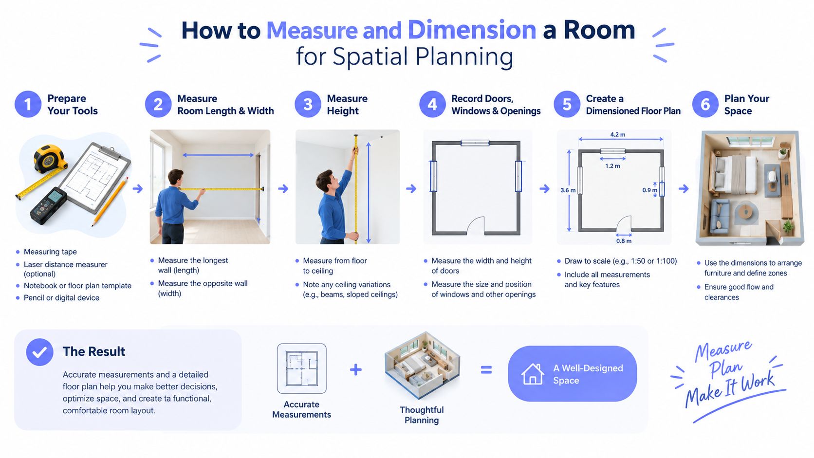
A floor plan is only as reliable as its measurements. Before placing furniture, create a dependable record of the room, then test the record against how people will move through it.
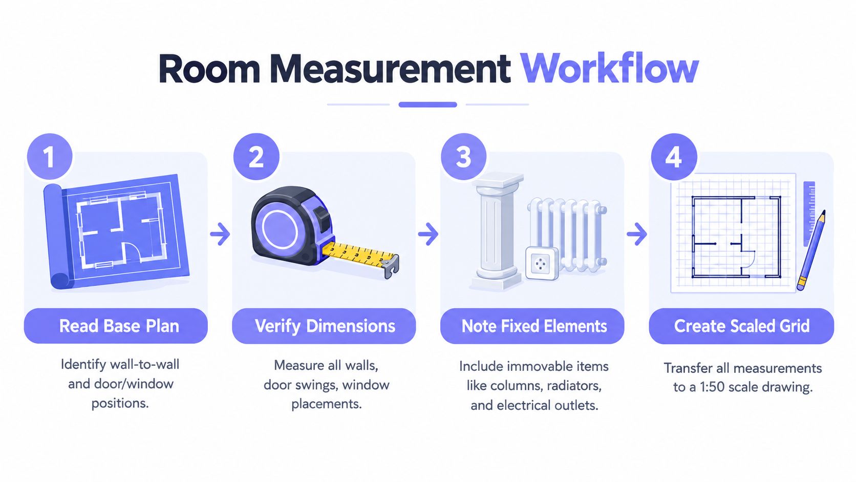
Start with the base plan
Read the plan wall to wall. Mark every door and window, including the direction each door swings. Record columns, radiators, vents, electrical outlets, plumbing points, built-in cabinetry, changes in level, and any element that can't move without construction work.
Verify dimensions on site rather than trusting a drawing that may be outdated. Measure opposing walls because rooms are rarely perfectly square, and note ceiling height where it affects storage, partitions, lighting, or furniture scale. Photograph each wall and label the images so the visual record matches the measured plan.
Draw routes before furniture
Mark the primary route in one color and secondary routes in another. Then add the clearances around doors, seating, beds, worktops, appliances, and exits. Keep the difference between a furniture footprint and a usable zone visible. A chair may fit on paper while its pulled-out position blocks a passage.
A useful efficiency measure is the relationship between circulation area and usable program area. One housing study recorded a minimum internal area of 30.57 m², with 5.90 m² allocated to circulation, producing a circulation-to-net ratio of about 1:5, as reported in this housing circulation study. The lesson isn't that every home should match that ratio. It's that reducing dead corridor length, aligning door swings, and combining routes can recover usable area without changing the building envelope.
For quick area checks, use a square-meter calculator for spatial planning, then confirm the result against the measured drawing and actual furniture requirements.
Check the distances that cause daily friction
| Location | Recommended clearance | Why it matters |
|---|---|---|
| Wheelchair maneuvering circle | 1,500 mm | Allows turning where wheelchair movement must be supported |
| Accessible door opening | About 900 mm | Improves approach and passage |
| Main path where two people pass | Roughly 1,050 to 1,200 mm | Reduces conflict in busy routes |
| Primary circulation | 36 inches minimum | Establishes a baseline clear route |
| Comfortable two-person passing | 42 to 48 inches preferred | Gives more ease in shared movement |
| Living-room seating area | About 18 inches around seating | Supports circulation and communication |
| Paths to seating and exits | 30 to 36 inches | Protects access to key destinations |
The residential seating and exit guidance is summarized in human-dimension planning reference material. For non-residential work, circulation and support space may consume 25 to 33 percent of usable area, and one planning reference gives a straight corridor minimum of 3 feet 8 inches for comfortable wheelchair operation and 5 feet for a two-way corridor. See the non-residential planning reference for that guidance.
Before you commit to a partition or furniture order, run a final verification. Open every door, pull out drawers, sit in each seat, walk the main routes while carrying something, and test the room when more than one person is moving. If a clearance only works when everyone stands still, it isn't working.
Room by Room Spatial Planning Examples and Mistakes to Avoid
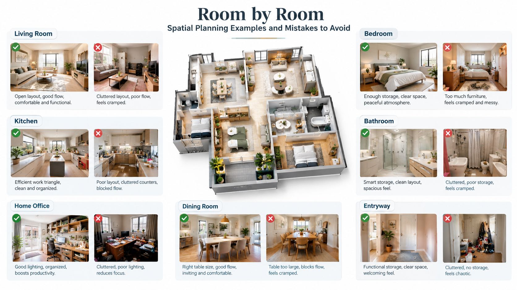
A layout can look balanced on paper and still fail at the first real movement. Someone carries food from the kitchen, opens a wardrobe, or crosses the room while another person is seated. Spatial planning makes those actions visible by treating each room as a measurable system of routes, pauses, zones, and clearances. The examples below start with the failure, then show the correction.
Living room
Common failure: An oversized sectional occupies the longest wall, leaving the only route to another room between the coffee table and seating. People cross the conversation zone, while the television sightline competes with movement.
Correction: Draw a primary route behind or beside the seating group where the room allows it. Keep about 18 inches around seating for circulation and communication, and aim for 30 to 36 inches on paths leading to seats and exits. The furniture placement guide can support the furniture test. If the living room connects to the kitchen, route movement around the social zone rather than through it. A broken-plan arrangement, such as a console, open shelving, or partial screen, can separate circulation without closing the room completely.
Kitchen
Common failure: A fixed island is sized for appearance, but its corners compress the route between cabinets and dining. Appliance doors open into the working path, and neither the refrigerator nor oven has enough landing space.
Correction: Show every appliance door in its open position, then test the path with two people. Mark the cooking, preparation, washing, and storage zones before refining the island shape. A movable island can retain useful work surface while allowing the room to change for everyday cooking or larger gatherings. In a compact kitchen, an appliance garage or concealed utility zone can reduce worktop clutter without placing another freestanding object in the circulation field.
Rapid ISO Mapper iterations help compare these options before finishes are selected. Check the route, appliance access, and relationship to the dining zone in each version. The useful option is the one that keeps the work sequence clear, not the one with the most attractive island.
Bedroom
Common failure: The bed is centered neatly, but one side is trapped against a wall or a wardrobe door opens into the approach. The room photographs well and performs poorly during dressing and bed-making.
Correction: Protect access on both sides where the users and room width allow it. Include wardrobe doors, drawers, and the bed's likely movement zone in the test drawing. If the bedroom shares a wall with a noisy family or work space, place a buffer such as a bathroom, storage zone, or corridor between them. This zoning change can improve privacy without increasing the bedroom's size.
Bathroom
Common failure: The door swing conflicts with the basin or toilet, while the shower entry narrows the route to other fixtures. Every object is present, but the sequence of use is awkward.
Correction: Test the door first, then turning movement and approach to each fixture. A pocket or outward-opening door may help where permitted, subject to local requirements and construction conditions. Keep the most direct route clear, and place storage where open doors and drawers will not create a temporary blockage.
Hybrid work or wellness nook
Common failure: A desk occupies a leftover corner without enough acoustic privacy, glare control, power access, or flexibility. The nook becomes a permanent workstation inside a room intended to feel restful.
Correction: Use a partial boundary, such as a screen, shelving, curtain, or glazed partition, when privacy matters. Keep the work surface near power and useful daylight while protecting the room's main route. Trend reporting on hybrid living and wellness spaces describes homes with more distinct functions, including offices, wellness rooms, and separated lounges. The practical test is whether each use can operate without disabling the others. A quick plan iteration should show both the active work position and the restored, non-work arrangement.
Workflows Checklists Tools and Client Deliverables That Speed Approval
A reliable planning workflow starts with a brief and ends with evidence. The sequence matters because visual styling can hide a weak plan if it appears too early.
Use a short planning loop
- Record the brief. Note users, routines, furniture to retain, privacy needs, storage pressure, daylight preferences, and future changes.
- Draw the bubble diagram. Group activities before drawing walls or buying furniture.
- Mark fixed conditions. Add doors, windows, services, structure, and constraints from the measured survey.
- Create the zoned plan. Separate primary routes, secondary routes, activity zones, and support zones.
- Test fit furniture. Draw pieces to scale, then add the clearances required for opening, sitting, turning, and passing.
- Compare zoning options. Show open, partially separated, and broken-plan arrangements where the brief has competing needs.
- Validate visually. Generate quick plan-based views to check sightlines, bottlenecks, furniture density, and the relationship between zones.
- Annotate the decision. Record what changed, which clearance drove the change, and what trade-off remains.
Client approval gets easier when every option answers the same questions: Where do people walk, where do they pause, what stays private, and what can change later?
Keep the review checklist visible
- Circulation: Are the primary routes clear at their narrowest points?
- Doors: Do swings collide with furniture, fixtures, or each other?
- Access: Is turning space available where the user profile requires it?
- Storage: Is everyday storage located near the point of use?
- Privacy: Can work, sleep, bathing, and television activities separate when needed?
- Acoustics: Does sound travel directly between incompatible activities?
- Daylight: Does a partition or tall cabinet block useful light?
- Flexibility: Can the room change use without moving half the furniture?
- Presentation: Can the client understand the plan without specialist drawing knowledge?
Vizcraft offers ISO Mapper for floor-plan isometric views, Interior Design for boards from floor plans, and Exterior Studio for exterior concepts from photos. These images support design discussion; verify dimensions, openings, scale, and construction intent against the source drawings.
The client-ready package should include a zoned plan, at least one isometric view, annotated circulation routes, furniture test fits, and a short decision summary. A guide to AI interior design software can help place that visualization step alongside the rest of the design workflow, rather than treating it as a replacement for measurement or professional judgment.
Frequently Asked Questions
When should I choose broken-plan over open-plan?
Choose broken-plan zoning when work, sleep, television, cooking, or wellness activities need privacy or acoustic separation. Partial boundaries preserve more daylight and visual connection than full-height partitions. Check each proposed divider against the circulation route, because a screen, storage wall, or partition reduces usable floor area and may force detours.
How much space does a home work nook need?
There is no universal area. Measure the desk, chair movement, storage, equipment, and privacy requirements first. Then add a clear route to the seat and test the nook during normal household activity. A layout works only if someone can reach the workstation without moving furniture or blocking another route.
How do I plan an awkward office-to-residential conversion?
Start with daylight, columns, services, entrances, and structural limits before assigning rooms. Office-to-residential conversions were expected to reach about 77,700 offices in 2025. That context makes constraint-led planning especially useful: solve the floor plate, service access, and circulation first, then apply the decorative direction.
Should storage be planned before furniture?
Yes. Map high-frequency storage and its access zones before positioning furniture. Hidden utility, appliance garages, under-stairs pantries, and integrated joinery can keep rooms orderly, provided doors open fully and daily routes remain clear.
Use ISO Mapper to convert a measured floor plan into a quick isometric view. Compare circulation, zoning, and furniture options before finishes are fixed. Visit Vizcraft to try it with 2 free credits, no card required.