Interior Design Concept Boards How to Build Them Fast
Learn how to create interior design concept boards from floor plans and photos, with layout, assets, AI variations and client-ready export tips.
You've got a client call in the afternoon, a floor plan on one screen, a folder of saved rooms on another, and no clear way to explain which direction deserves approval. A collage of attractive images won't solve that problem. A useful board must help the client choose a design direction, understand how it fits the room, and approve the next round of work without guessing.
Interior design concept boards work best when they connect feeling to decisions. The board can begin with abstract references, then become more specific as the client approves the palette, materials, furniture direction, and spatial arrangement. With the right workflow, you can move from a measured plan or room photo to several client-ready visual options without rebuilding the entire presentation each time.
Table of Contents
- What Interior Design Concept Boards Actually Do
- What to Gather Before You Build the Board
- How to Build a Concept Board That Clients Can Approve
- Creating Style Variations From Plans and Photos Without Rework
- Layout Tips That Keep Boards Clear and Client Ready
- Frequently Asked Questions About Interior Design Concept Boards
What Interior Design Concept Boards Actually Do
A concept board is a presentation tool for communicating a project's overall feeling and spatial intent before product selection is finalized. It may combine photographs, sketches, textures, color references, and other visual elements, but those assets need to support one design idea. Houzz's distinction between concept boards and mood boards is useful here: a concept board establishes direction, while a shopping list identifies items to buy.
A mood board is usually looser and more atmospheric. It helps a designer explore what feels coherent, often before the room's decisions are fully defined. A concept board should go further. It should show how that feeling relates to the room, its function, its proportions, and the choices that will follow.
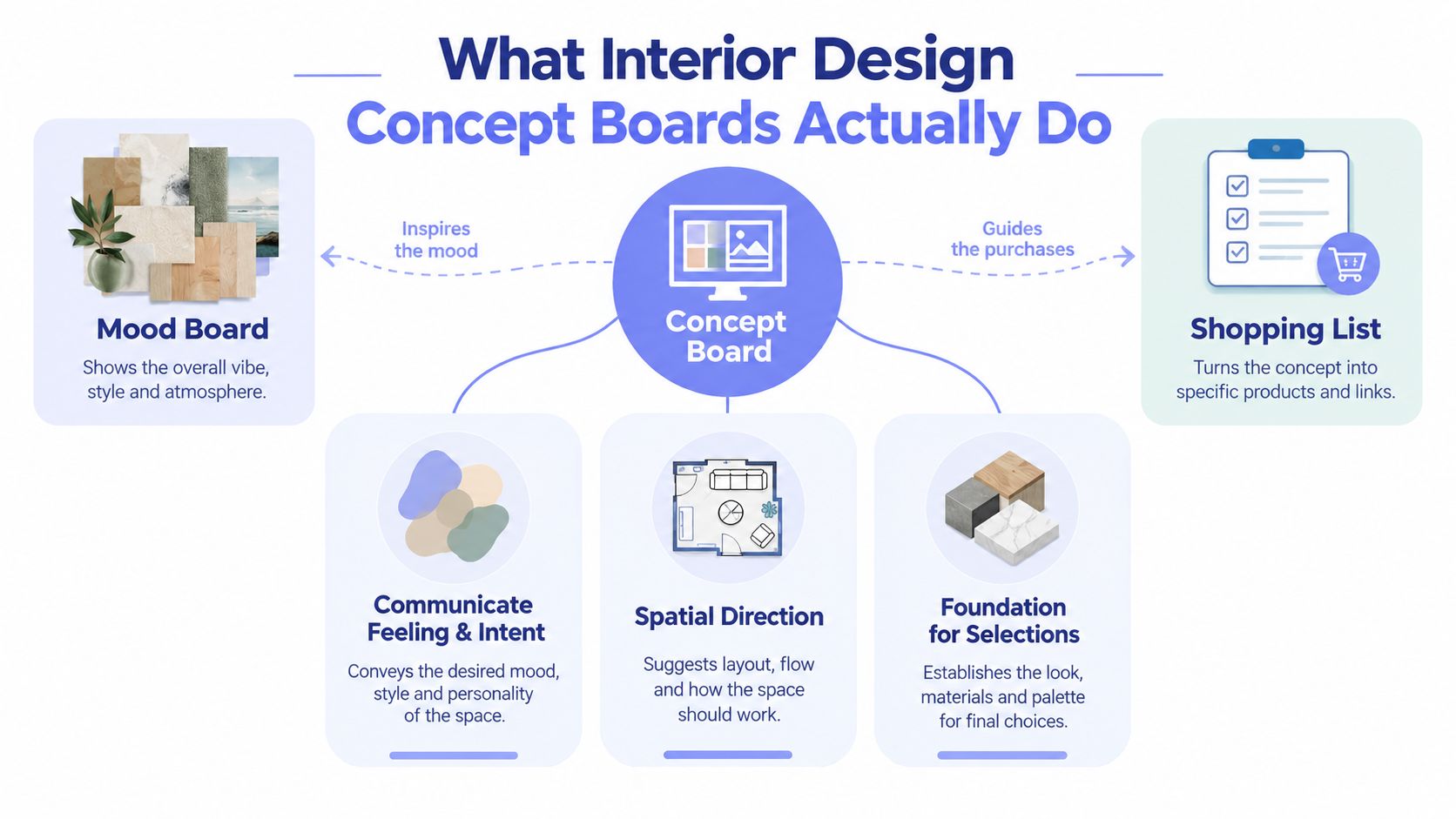
Practical rule: If a client can admire the board but can't explain what they're approving, the board is still inspirational rather than decision-ready.
The board earns its place in the workflow by answering practical questions. Is the room intended to feel calm, collected, dramatic, or informal? Which colors lead, which materials repeat, and how will the furniture occupy the plan? The strongest boards also include a concise written rationale that ties each reference to the brief, rather than relying on the viewer to infer the logic.
This is why curation matters more than volume. A board with unrelated images may communicate taste, but it won't create a reliable foundation for sourcing or documentation. The relationship between design board architecture and client decisions becomes clearer when the board is treated as a controlled argument: establish the concept, show the spatial direction, and make later selections easier.
What to Gather Before You Build the Board
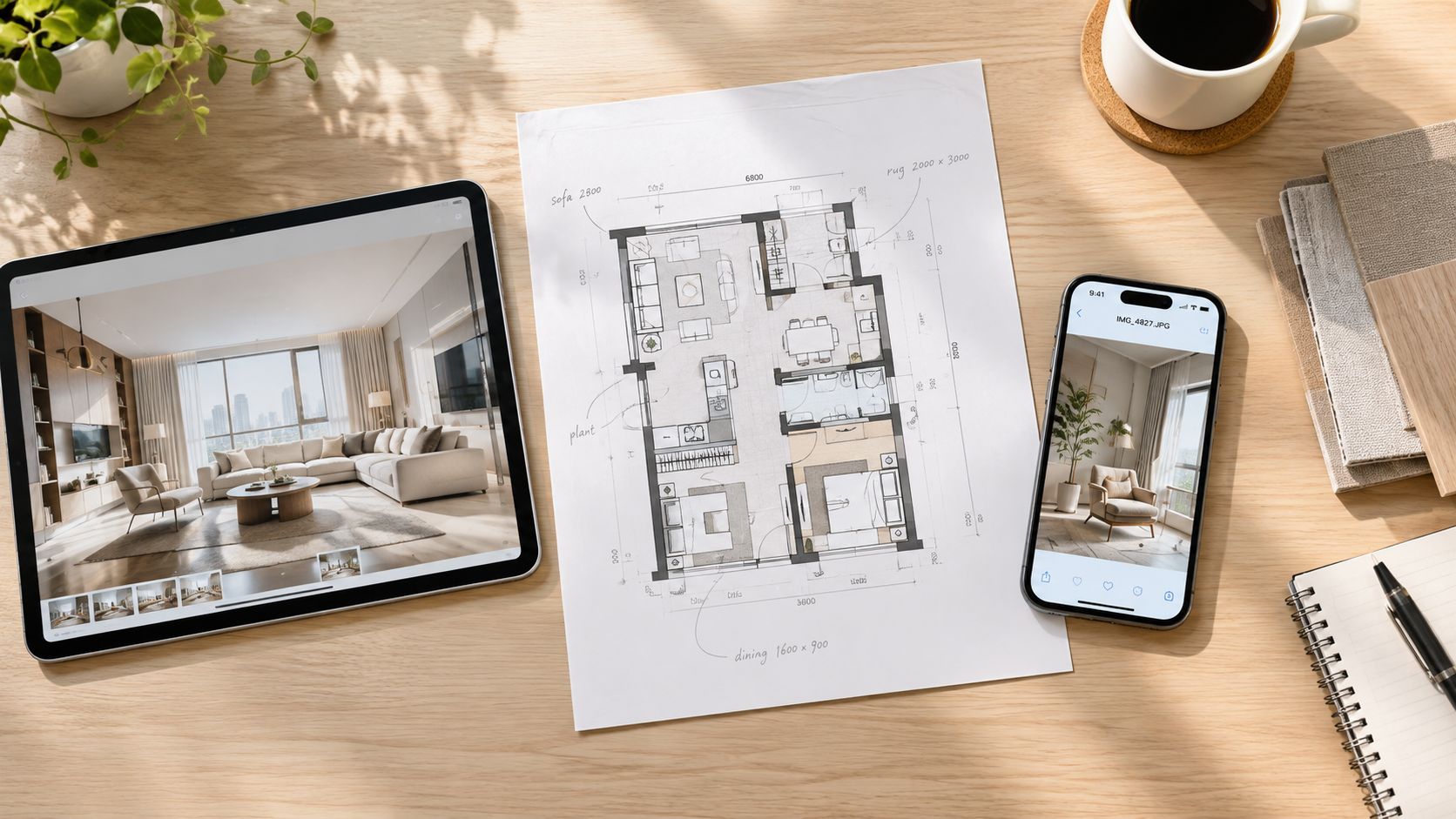
Start with the room, not the image library. Gather the cleanest available measured floor plan or room photograph, then confirm that walls, openings, circulation paths, and proportions are readable. Useful image formats include JPG, PNG, HEIC, and WebP, which are supported by many current visual workflows.
A floor plan should show the information needed to understand adjacency. Check door swings, windows, built-in elements, major fixtures, and any dimensions that affect furniture placement. For a room photo, check the camera angle, visible corners, ceiling line, window position, and signs of distortion. A beautiful reference image can't compensate for an incorrect understanding of the space.
Establish the brief before collecting references
Write a one-sentence project basis before opening Pinterest, a stock library, or your saved folder. State the room, its main function, the intended atmosphere, and the practical constraint that matters most. For example, the basis might describe a family living room that needs to feel warm and composed while protecting clear circulation.
Then write a concept statement in 2 to 3 sentences, a format recommended in this concept-board guide. Keep it specific enough to guide selection, but open enough to allow several visual interpretations. “Comfortable modern living room” is too broad. A statement that identifies restrained geometry, tactile natural materials, and a grounded palette gives the board something to test.
Collect references broadly at first, then label why each one belongs. A note such as “soft contrast supports evening use” is more useful than “I like this room.” After collecting, cluster repeated ideas, remove conflicts, and identify the references that express the project most clearly.
Define the color roles early
Assign color roles before arranging the board. Label the palette as primary, secondary, and accent, then consider a 60/30/10 distribution to describe how those roles might appear in the room, as outlined in the same concept-board structure. The exact mix can change, but the role system prevents every color from competing for attention.
For a faster visual start, a mood board generator workflow can help organize references before you refine the presentation manually. The tool doesn't replace judgment. You still need to verify that every image supports the brief and that the underlying room information is accurate.
How to Build a Concept Board That Clients Can Approve
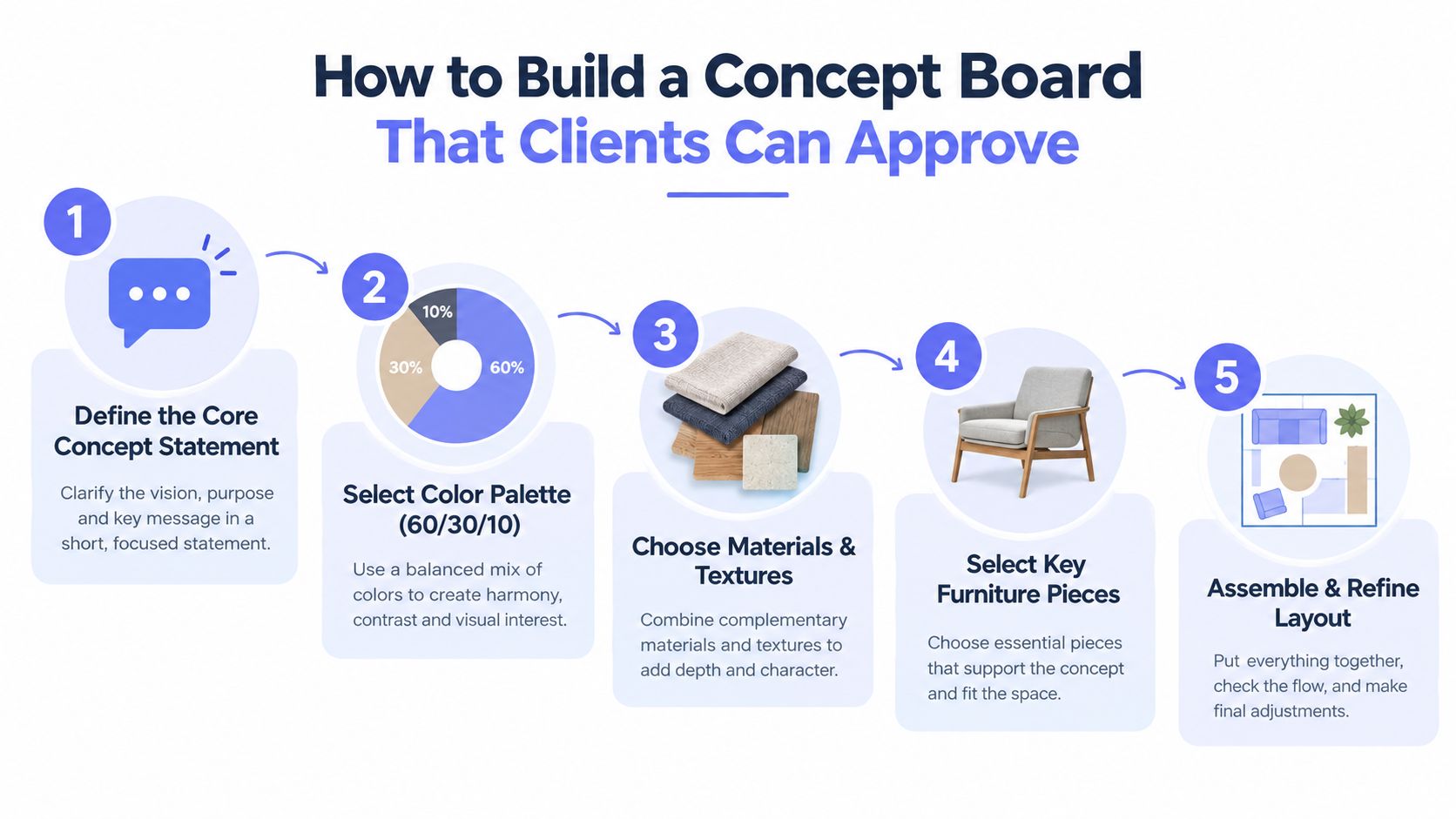
Approval becomes easier when the board follows the same order that a client naturally thinks through the project. Start with the concept statement, then show the palette, material language, furniture direction, and spatial relationship. Don't begin with a dense product grid. The client needs to understand the idea before evaluating its individual parts.
Keep the written statement short. Two or three sentences are enough to explain the intended atmosphere, the room's function, and the design logic. Use the statement as a filter. If an image is attractive but doesn't reinforce the brief, remove it.
Build from broad direction to physical decisions
Place the color palette near the concept statement so the client can read the visual hierarchy immediately. Identify the primary, secondary, and accent roles, using the 60/30/10 framework when it clarifies distribution. Avoid treating those proportions as a final specification. At this stage, they explain emphasis, not exact quantities.
Material references should communicate texture, reflectance, and contrast. Include flooring, wall treatment, worktop or surface direction where relevant, metals, fabrics, and other finishes that materially affect the room. Keep early references abstract enough to preserve flexibility, but make them concrete enough that the client can compare one direction with another.
Furniture references should show scale and character rather than become a complete shopping list. A sofa image can establish silhouette and upholstery direction. A chair, table, or lighting reference can establish proportion and visual weight. If a particular item is already fixed, label it as retained rather than allowing the client to assume every image is a proposed purchase.
Spatial visualization closes the gap between atmosphere and layout. Include a measured plan, room diagram, or perspective that shows how the chosen direction fits the space. Interior design presentation guidance recommends including the floor plan, color scheme, and finish categories, because the board needs to communicate spatial relationships rather than only surface appeal.
Arrange samples so the room reads naturally
Use adjacency logic. Put flooring samples toward the bottom, place upholstery swatches close to the sofa reference, and group wall finishes with the elements they affect. This arrangement helps the reviewer understand how the pieces relate inside the room.
Keep images aligned, avoid unnecessary tilt, and leave enough negative space for the board to breathe. Uneven angles and crowded samples make a direction look less resolved, even when the selections are strong. The board should scan from concept to palette to materials to furniture to plan without forcing the client to decode the layout.
After approval, convert every accepted material into a spec schedule. Track the product reference, supplier, finish, and location for each line item. This step separates a concept board from a decorative collage and gives the team a practical record that can be priced, sourced, and installed without ambiguity.
For a polished client-facing package, the interior design client presentation workflow can help you connect the board to the wider approval conversation. The board should make the next decision obvious, whether that means approving the palette, selecting between two furniture directions, or authorizing detailed sourcing.
Creating Style Variations From Plans and Photos Without Rework
The expensive part of a concept board isn't always the software. It's the repeated setup. If every style option requires rebuilding the plan, furniture arrangement, lighting, and presentation from scratch, designers tend to show fewer alternatives than the client needs.
Vizcraft offers ISO Mapper for floor-plan isometric views, Interior Design for boards from floor plans, and Exterior Studio for exterior concepts from photos. These images support design discussion; verify dimensions, openings, scale, and construction intent against the source drawings.
Stay abstract while the client is choosing between broad directions. Test warm minimalism against richer eclecticism, or a light palette against a darker one, before locking exact suppliers and finishes. Once the client approves the concept, tighten the board around real materials and tracked specifications.
Cost and speed for concept board visuals
The table below gives the required comparison structure. Studio and freelancer pricing varies by scope, resolution, revisions, and whether the work includes modeling or only visual output, so treat those columns as working ranges rather than fixed quotes. Vizcraft's listed per-render range is based on its published plan pricing.
| Deliverable | Studio Range | Freelancer Range | Vizcraft AI Per Render |
|---|---|---|---|
| Concept-board visual | Typically varies by scope | Typically varies by scope | $0.40 to $0.76 |
| Isometric floor-plan option | Typically varies by scope | Typically varies by scope | $0.40 to $0.76 |
| Photo-based style variation | Typically varies by scope | Typically varies by scope | $0.40 to $0.76 |
Vizcraft lists Starter at $19 per month for 25 renders, Pro at $49 per month for 100 renders, and Studio at $99 per month for 250 renders, with one-time packs starting at $7. Generation time depends on the input and workflow; allow time for geometry review before presenting options. See the current Vizcraft pricing details before assigning a project budget, since the plan determines the effective per-render cost.
For floor-plan-led work, use ISO Mapper for isometric floor-plan visuals when the client needs to understand the arrangement as well as the mood. For photo-led work, preserve the original image as the base and change one meaningful variable at a time. If you alter color, lighting, furniture, and material language together, the client may not know which change created the improvement.
A practical client presentation workflow keeps the variations comparable. Name each direction, hold the camera or plan view steady, and place the alternatives side by side on the board. You can try it with 2 free credits on signup, no credit card required.
Layout Tips That Keep Boards Clear and Client Ready
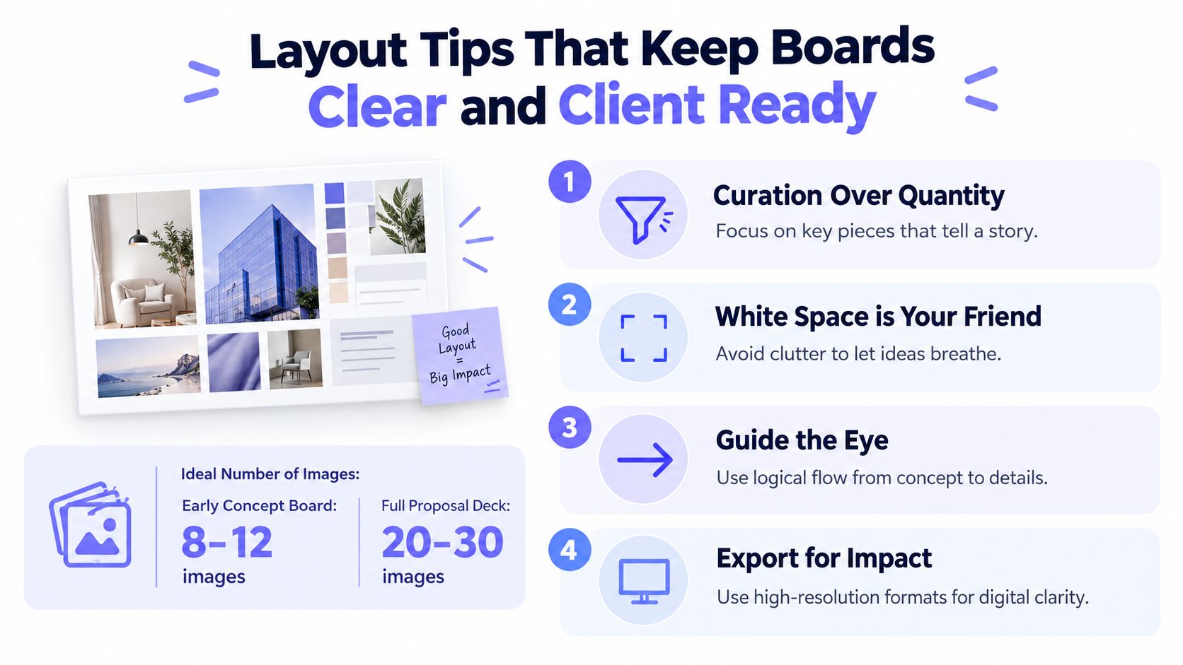
A clear board controls attention. It doesn't attempt to display every reference collected during research. For an early mood direction, one recommendation is to keep the board to 3 to 7 images, with a maximum of 10 images, while a fuller presentation deck may use 8 to 12 images to cover materiality, furniture, color, and lighting direction. These ranges are documented in guidance on mood-board image selection.
Use the smaller range when the client is approving an idea. Add detail only when the deliverable needs to support a fuller proposal. More images don't automatically create more confidence. They can dilute the hierarchy and make competing styles appear equally important.
Make every visual carry a job
Put the concept statement where it can be read before the images. Keep it within 2 to 3 sentences, then label the color roles as primary, secondary, and accent. Arrange materials in room order, not in the order you found them. Flooring, walls, fixtures, furniture, and fabrics should read as parts of a space rather than unrelated samples.
Layout check: Remove any image that doesn't clarify mood, scale, materiality, or placement.
Avoid tilted images unless the angle communicates a deliberate spatial relationship. Align edges, use consistent crops, and preserve negative space around the strongest reference. Export a high-resolution file for digital review and proposal use, then check the result at the size your client will view. Small labels and material notes should remain readable without zooming through the whole board.
Bold directions can still be client-safe. Recent 2025 trend reporting highlights expressive maximalism, eclecticism, darker colors, artisanal choices, Art Deco revival, and textured finishes, while Pinterest-related interest has highlighted cherry red, handpainted furniture, and eclectic maximalism, as reported by Vogue's interior design trends coverage. Those signals are useful starting points, not reasons to force a trend into every project.
Tie each bold choice to the brief in writing. Cherry red might work as a controlled accent in an otherwise restrained scheme. Art Deco references might support a client's preference for geometric detailing without turning the entire room into a period replica. The rationale protects the project from trend fatigue because the choice remains connected to function, atmosphere, and the client's stated priorities.
For a plan-based board, floor-plan isometric view guidance can help you decide how much spatial information belongs beside the visual references. Keep the plan legible, and don't let it compete with the concept image for first attention.
Frequently Asked Questions
When should a concept board become decision-ready?
It should shift from inspiration to decision-making once the client can identify the concept, palette roles, material direction, and spatial intent. Add a written rationale and remove references that don't support those choices.
How can I use bold trends without making the board risky?
Use the trend as a controlled variable. Test cherry red, darker colors, maximalism, or Art Deco revival in a defined role, then explain how the choice serves the brief. Keep permanent or expensive selections less trend-dependent unless the client explicitly wants a strong commitment.
Does every concept board need a floor plan?
Not every early mood board needs one, but a decision-ready interior design concept board benefits from a measured plan or spatial visualization. The plan shows whether the visual direction can work with the room's openings, proportions, circulation, and furniture arrangement.
How many images should a board include?
For an early mood direction, aim for 3 to 7 images, with a maximum of 10 images, based on mood-board selection guidance. A fuller presentation can use 8 to 12 images when it needs to explain more categories, but keep the narrative curated.
Vizcraft offers ISO Mapper for floor-plan isometric views, Interior Design for boards from floor plans, and Exterior Studio for exterior concepts from photos. These images support design discussion; verify dimensions, openings, scale, and construction intent against the source drawings.