Interior Design Color Boards That Win Client Approvals
Build interior design color boards that get client sign-off faster, plus tips for pairing boards with renders and virtual staging visuals.
A client reviews three interior design color boards and likes every individual sample. The stone works. The paint feels calm. The textile looks expensive. Then someone asks, “What does this look like in the room?” That question exposes the difference between a persuasive board and a procurement-ready design package.
A useful board must connect color, material, scale, lighting, and visual context before approval. It should help a client understand the finished room, give a contractor enough information to request pricing, and give the studio a stable reference when renders, virtual staging images, and site decisions begin to multiply.
Table of Contents
- When a Pretty Board Is Not Enough
- Building the Palette in the Right Order
- The 60-30-10 Rule and Locking Fixed Elements First
- The Six Content Types Every Board Should Carry
- Pairing the Board With Renders and Virtual Staging
- Why Most Boards Fail on Lighting and Material Reality
- Turning the Board Into a Procurement Document
When a Pretty Board Is Not Enough
The problem usually isn't a lack of taste. It's a lack of hierarchy. A board may contain attractive paint chips, a marble photograph, a sofa reference, and several atmospheric images, yet still leave the client to assemble the room mentally. Individual samples don't explain proportion, adjacency, reflection, or the way a finish will sit beside a window.
Interior design color boards have served this communication role since the early 20th century, when designers used physical boards with fabric swatches, paint chips, and printed images to communicate a room's color, mood, and style. Their adoption expanded through the mid-century period and became common across design disciplines by the 1980s, establishing the board as a visual language for approvals and collaboration. The history is documented in this design-history overview of color boards.
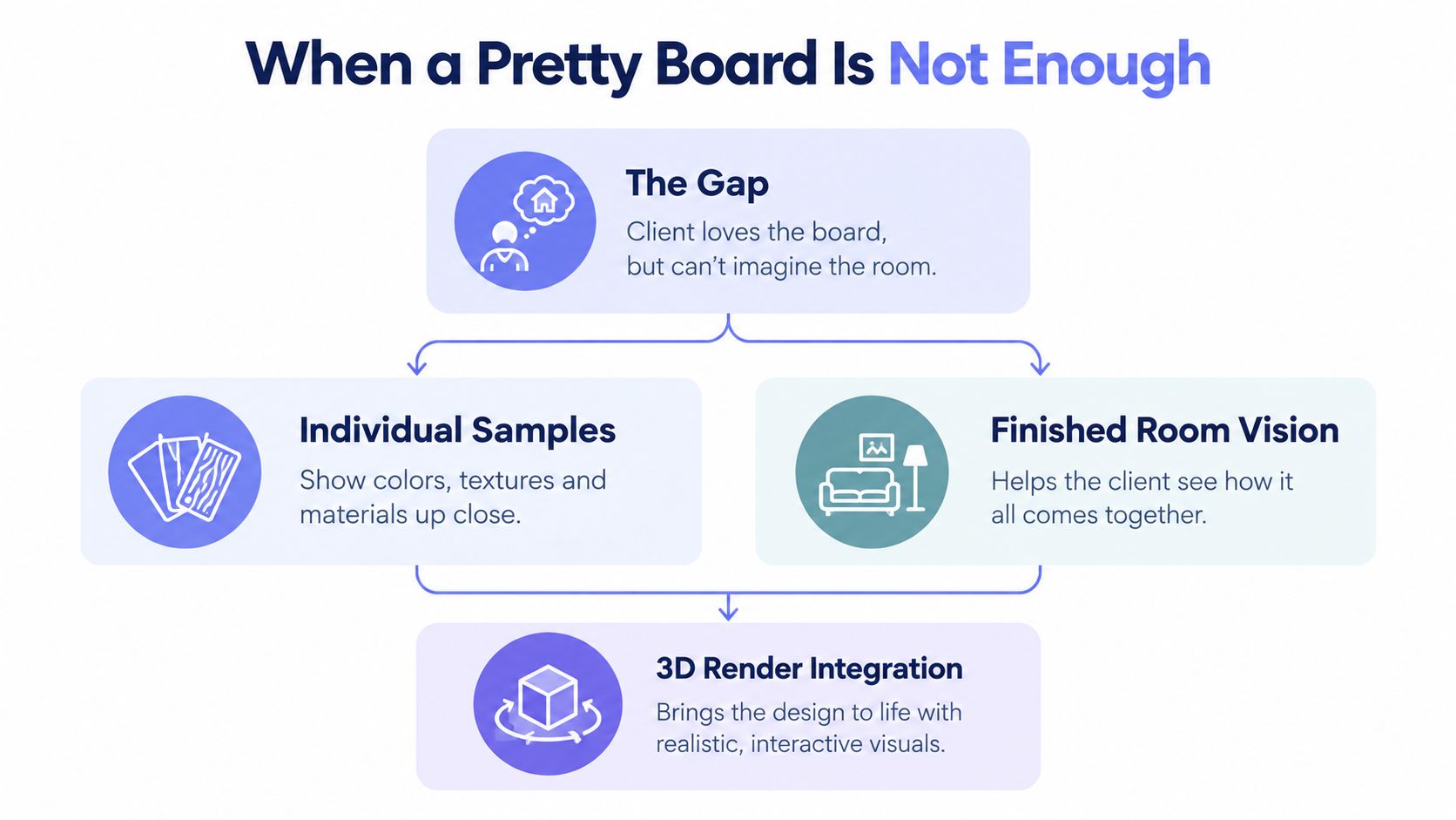
The approval test
A board survives review when the client can answer three practical questions:
- What is the intended visual direction?
- Which elements are fixed, and which are still flexible?
- How will the approved choices appear at room scale?
That means the board shouldn't compete with a render. It should control the render. The same anchor color, hero material, furniture direction, and lighting logic should carry into the visualization package instead of producing a beautiful board followed by an unrelated image.
| Component | Purpose |
|---|---|
| Project brief | Defines the room's use, mood, constraints, and approval criteria |
| Mood direction | Establishes the visual character without replacing specifications |
| Color palette | Identifies dominant, supporting, and accent colors |
| Material and finish samples | Shows texture, reflectance, grain, and surface relationships |
| Plans or renderings | Demonstrates scale, layout, and room context |
| FF&E schedule | Connects selected furniture and equipment to procurement |
| Lighting plan | Clarifies fixture direction, atmosphere, and illumination |
| Timeline or budget summary | Gives the client a practical delivery framework |
A useful reference for comparing atmosphere with specification is the blue mood board approach from Lewis and Sheron Textiles. The value isn't the color itself. It's the discipline of showing how a color direction gains meaning from adjacent fabrics, finishes, and context.
The working standard is simple: if a contractor can't identify what to price, or a client can't understand what the room should feel like, the board is still an inspiration collage.
Building the Palette in the Right Order
Start with the brief, not Pinterest, a saved image folder, or a favorite paint color. The brief should produce one sentence that controls the board, such as “calm, tactile, restoration-led bedroom” or “durable, warm contemporary kitchen for daily family use.”
That sentence gives every later choice a job. If an image is attractive but doesn't support the sentence, it doesn't belong on the board.
A reliable build sequence
- Write the project sentence. Include use, mood, and any performance constraint that affects finishes.
- List fixed elements. Record existing or already-approved flooring, stone, joinery, windows, doors, and large furniture.
- Choose one palette anchor. This might be a wall color, a fixed stone tone, a timber undertone, or another element that sets the visual temperature.
- Lock one hero material. Select the material that gives the room its strongest tactile or visual identity.
- Add 3–5 surrounding colors. These should support the anchor and hero material, not introduce separate stories.
- Curate furniture, lighting, and context imagery. Collect these only after the palette logic has been established.
This order is supported by the practical color-board workflow from Matterbase, which places the brief first, followed by one palette anchor, one hero material, and 3–5 surrounding colors before wider curation. The same guidance identifies image-first collecting as the most frequent cause of boards that look coherent online but fail against real samples, scale, and lighting.
Practical rule: If you can remove the hero material and the board loses its logic, you haven't selected supporting colors. You've collected decoration.
A small worksheet makes the sequence repeatable:
| Worksheet field | Record |
|---|---|
| Brief keywords | Use, mood, maintenance, durability, and project constraints |
| Fixed elements | Flooring, stone, joinery, large furniture, and architectural features |
| Palette anchor candidate | The color or fixed finish that sets the direction |
| Hero material candidate | The primary tactile or visual reference |
| Supporting tones | 3–5 colors that reinforce the anchor |
| Rejection test | Choices that look good alone but conflict with the project sentence |
A mood board generator for interior workflows can help organize early references, but it shouldn't decide the sequence. The designer still has to establish the brief, select the anchor, validate the material, and reject options that won't survive execution.
The 60-30-10 Rule and Locking Fixed Elements First
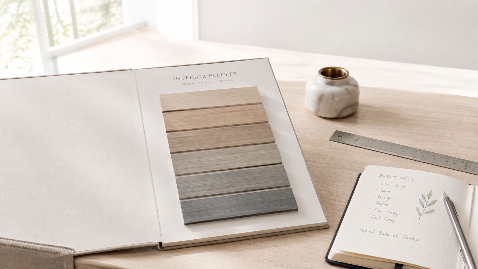
The 60-30-10 rule is useful because it gives clients and contractors a readable hierarchy. It distributes the visual field into a dominant color, a supporting color, and a smaller accent. It isn't a substitute for design judgment, but it helps prevent a board from presenting every color as equally important.
Professional guidance commonly converges on 2–3 main colors, 2–3 supporting tones, and 1 accent color, while recommending that flooring, stone, joinery, and large furniture be selected first. The palette should respond to those difficult-to-change elements, not force them to accommodate a fashionable paint selection. This framework is outlined in the color-board guidance from QC Design School.
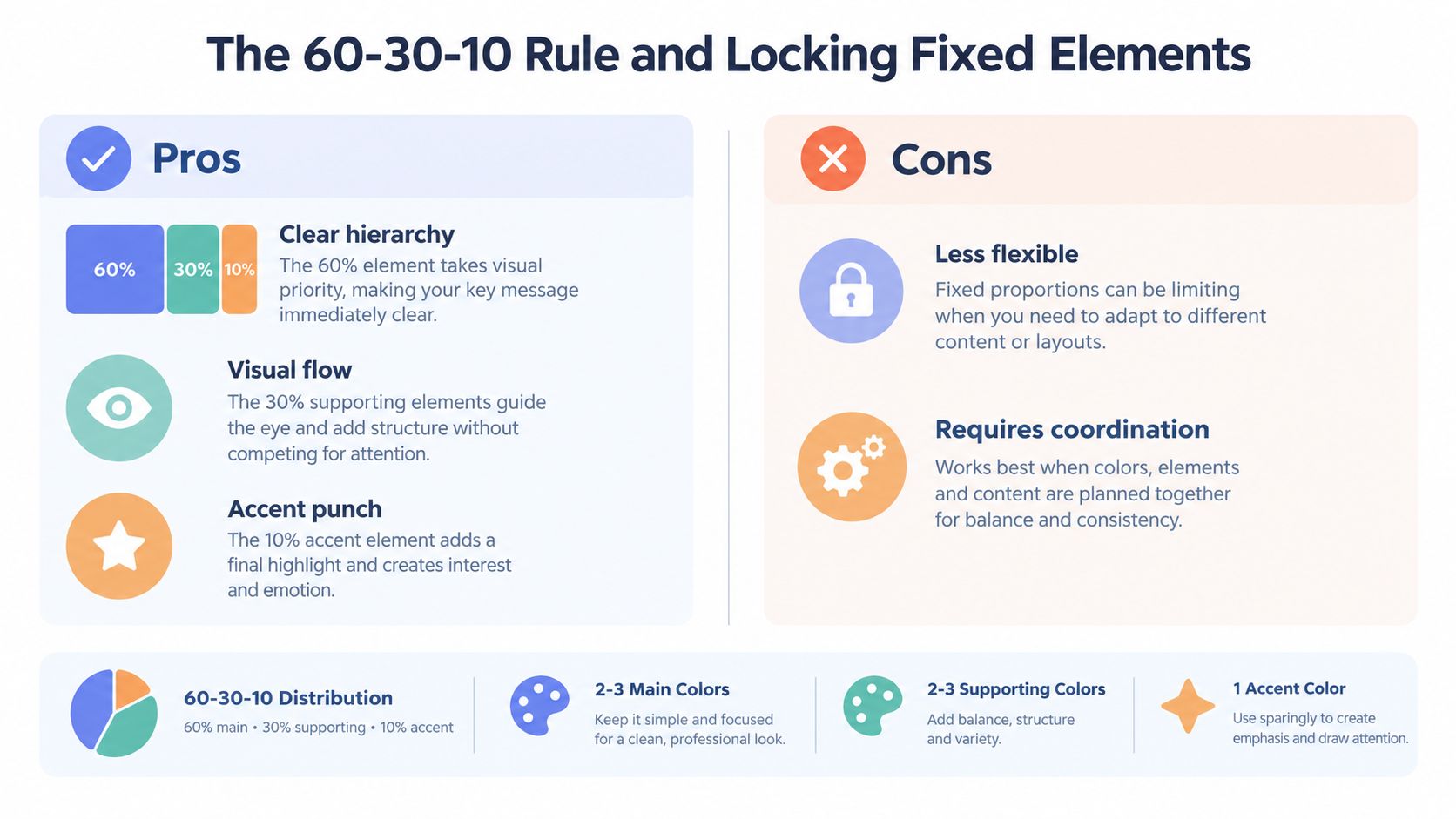
A warm-neutral living room example
For a warm-neutral living room, the distribution could read like this:
- 60% dominant: warm off-white or soft taupe across the main walls and larger background surfaces.
- 30% supporting: medium timber, warm upholstery, or a related clay and brown family across flooring, furniture, or millwork.
- 10% accent: oxblood, olive, aged brass, or another controlled note in art, cushions, hardware, or a small object.
The exact color selection depends on the fixed materials. A cool stone may pull the supposedly warm neutral cooler. A yellow timber may make a beige wall appear pinker. The rule provides structure, but the samples determine whether the structure is credible.
Lock these before final paint selection
- Flooring and rug direction
- Stone, tile, and grout relationships
- Joinery timber, stain, or laminate
- Large upholstered furniture
- Window treatments and major metal finishes
- Existing architectural elements that remain visible
Documentation turns the board into a working specification. Name the paint brand, record the color code, state the surface where the color applies, and identify the supplier or product reference. Include dimensions for furniture, slabs, hardware, and lighting wherever those details affect ordering or coordination.
The rule's weakness is that it can appear more mathematical than a real room. Its strength is that it gives approval meetings a shared vocabulary. Use it as a reading aid, then let material undertones, texture, and light make the final call.
The Six Content Types Every Board Should Carry
A professional board is a compact system, not a mood dump. Keep the content to six types: palette, hero materials, supporting textures, furniture, lighting, and context imagery. Limiting the categories forces editing and helps the client understand one direction instead of comparing several unfinished concepts.
What belongs on the board
| Content type | Sample artifact | What to annotate |
|---|---|---|
| Palette | Paint fan deck or labeled color swatches | Brand, code, sheen, and application surface |
| Hero materials | Stone, timber, tile, or metal sample | Product name, finish, dimensions, supplier, and lead-time note |
| Supporting textures | Textile memo, rug sample, or veneer reference | Fiber or finish, colorway, code, and supplier |
| Furniture | Styled furniture reference or product image | Manufacturer, model, dimensions, upholstery, and finish |
| Lighting | Fixture reference or lighting direction image | Fixture type, finish, lamp specification, supplier, and placement |
| Context imagery | One small room or atmosphere image | What it demonstrates, such as mood, scale, or light quality |
The palette should specify exact colors rather than rely on a photograph. The 1–3 hero materials need enough physical or visual evidence to show why they lead the scheme. Supporting textures should add depth without creating a second material language.
Furniture references establish proportion and comfort, while lighting direction explains whether the room should feel diffuse, directional, warm, sculptural, or quiet. Context imagery has a narrower job than many designers give it. One well-chosen image can explain atmosphere, but a large collection usually dilutes the project sentence.
A board should answer “what is this?” before it answers “do you like this?”
For unusual combinations, material research can be useful before ordering samples. A visual reference such as blue white marble for interiors can help a studio assess how a distinctive stone might relate to timber, paint, metal, and textiles. It still doesn't replace a slab sample or supplier confirmation.
The design-board architecture workflow is most effective when each item earns its place through a decision. Annotate finish names, codes, dimensions, and suppliers directly on the board or in a linked schedule. Remove any image that has no role in selection, proportion, procurement, or client understanding.
Pairing the Board With Renders and Virtual Staging
The board answers what the room is made of. A render answers how those decisions occupy space. A virtual staging image answers how an existing room could support the same direction. Sending all three without a shared palette creates confusion, so the visualization should be generated from the approved board and the same floor plan wherever possible.
Digital color-board workflows expanded significantly in the 1990s and 2000s, when designers could revise and distribute interactive boards rather than rely only on static foam-core presentations. Those boards could include links, video, and product references, which made remote review and faster collaboration more practical, as described by Next.cc's overview of mood-board development.
Match the visual to the decision
- 3D isometric map: Use it to confirm adjacency, circulation, room relationships, and the location of fixed finishes.
- Photoreal render: Use it to review color balance, material scale, furniture proportion, and lighting direction.
- Virtual staging image: Use it to show how a room photo can support a proposed furniture and finish direction.
- Room variation: Use it when the client needs controlled alternatives, such as a different textile or accent while the anchor remains fixed.
Vizcraft offers ISO Mapper for floor-plan isometric views, Interior Design for boards from floor plans, and Exterior Studio for exterior concepts from photos. These images support design discussion; verify dimensions, openings, scale, and construction intent against the source drawings.
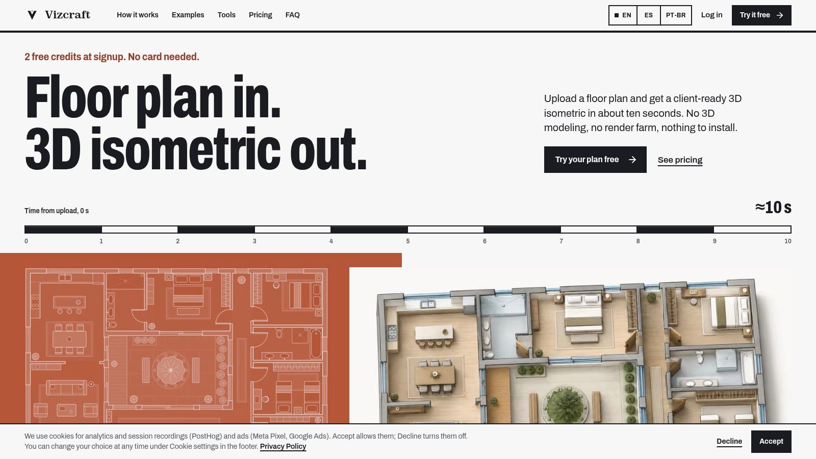
Cost matters when a studio promises iterations. Vizcraft's listed plans create a predictable band for AI-assisted visual work, while traditional studio rendering can involve scene setup, modeling, revisions, and longer scheduling. Those traditional costs vary by scope, so quote them separately rather than implying a direct price equivalence.
| Plan | Monthly cost | Renders included | Per-render cost |
|---|---|---|---|
| Starter | $19/mo | 25 renders | $0.76 |
| Pro | $49/mo | 100 renders | $0.49 |
| Studio | $99/mo | 250 renders | $0.40 |
The listed per-render range is $0.40–$0.76, and one-time packs start from $7, according to the Vizcraft pricing page. Render with turnaround depending on the input and workflow, which makes live option review practical, but speed doesn't remove the need for design control.
For a broader visual reference, studios comparing presentation styles can review realistic AI decor images. If virtual staging is part of your package, document which elements are conceptual and which are approved products. The workflow is covered in this guide to how to do virtual staging.
Try the workflow with 2 free credits on signup, no credit card required, before deciding whether it fits your proposal process.
Why Most Boards Fail on Lighting and Material Reality
The hardest part isn't finding a fashionable hue. It's proving that the hue works beside actual materials, under the room's light, on the specified surface. A screen image can make a palette look balanced while a physical sample reveals a green cast, excessive contrast, or a sheen that changes the perceived value.
Trend coverage can create useful context, but it shouldn't replace testing. Fixr reports that 93% of interior design experts say blue-toned grays are on the way out in 2026, while 66% favor restorative greens, alongside a broader move toward warmer, restorative palettes. Those figures belong in trend discussion, not as a reason to specify green before checking the room's orientation and materials. See the Fixr coverage of interior design color trends.
Run the reality check
- North light: Review samples for a cooler, less direct reading and watch warm neutrals for unwanted dullness.
- South light: Check whether warm colors become too strong or whether reflective finishes create glare.
- Evening light: Test the palette under the fixtures specified for the room, not only daylight.
- Paint sheen per surface: Record whether walls, joinery, ceilings, and trim use different sheen levels.
- Sample swatch under spec: Place paint and material samples together, at usable scale, rather than judging isolated chips.
- Supplier confirmation: Verify the product name, finish, availability, and any variation that could affect the approved direction.
The PBR materials guidance for CAD rendering is relevant when a render must represent material response, but a render remains a visual aid. The final approval should still reference real samples, confirmed specifications, and the lighting conditions expected in the finished room.
Turning the Board Into a Procurement Document
A presentation board becomes operational when every visible decision has a corresponding record. Put the floor plan first, then the color scheme, followed by flooring and wall recommendations. This read order moves from spatial structure into finish selection and supports procurement and site coordination, consistent with interior presentation-board guidance from Study.com.
Build the handoff around an FF&E schedule. Assign each furniture, fixture, and equipment reference a product name, supplier, code, dimensions, finish, quantity, and status. Do the same for paint, stone, tile, timber, hardware, and textiles. A budget summary and lighting plan turn the board into a client deliverable rather than a presentation image.
Use the square meter calculator to keep area assumptions consistent when estimating flooring, wall finishes, or other surface quantities. Record where measurements came from and flag allowances for supplier confirmation instead of hiding uncertainty inside a visual.
A final board checklist should include:
- Brief: One sentence that controls the direction.
- Anchor: One palette anchor tied to the project.
- Hero material: One primary tactile or visual reference.
- Supporting tones: 3–5 colors that reinforce the anchor.
- Six content types: Palette, hero materials, textures, furniture, lighting, and context.
- Annotations: Codes, finishes, dimensions, and suppliers.
- Lighting check: North, south, evening, sheen, and sample review.
- Procurement handoff: FF&E schedule, lighting plan, timeline, and budget summary.
Vizcraft offers ISO Mapper for floor-plan isometric views, Interior Design for boards from floor plans, and Exterior Studio for exterior concepts from photos. These images support design discussion; verify dimensions, openings, scale, and construction intent against the source drawings.